gomule
Lorem ipsum
gomule
Your all-in-one moving checklist — everything you need in one place for a smooth, stress-free move.
My role
At gomule, I was responsible for the entire UX and UI design process — from the first mockups to the launch of the app’s MVP in the App Store.
As the sole designer, I collaborated closely with developers and business stakeholders to create a user-friendly product that aligned with technical requirements.
Through user research, interviews, and continuous iterations, I translated insights into concrete design solutions in Figma and built a cohesive design system and visual identity.
My work significantly improved the app’s usability and strengthened cross-team collaboration.
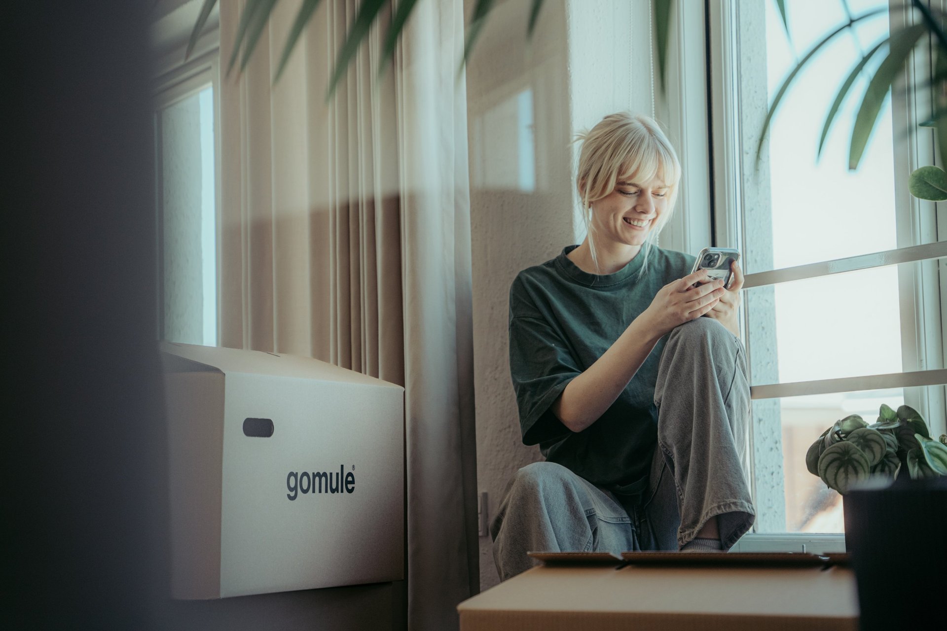
Moving often feels chaotic and overwhelming, with countless tasks and deadlines to manage. gomule brings everything together in one digital platform, creating structure and giving you full control from start to finish — making your move stress-free and letting you enjoy the process.
Problem statement
Working with
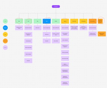
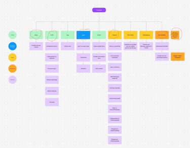
Design Thinking
The process began with Empathize, where I conducted user interviews and behavioral analyses to gain deep insight into user challenges.
In the Define phase, I translated these insights into clear problem statements and prioritized design goals.
During Ideate, I facilitated creative workshops and developed concepts in close collaboration with developers and stakeholders.
In the Prototype phase, I created wireframes and interactive prototypes in Figma, which were refined in the Test phase through user testing and iterative feedback loops.
This iterative approach allowed us to build, test, and improve quickly — resulting in an intuitive product design that supported Gomule’s business objectives and met users’ real needs.


Workshops and user testing
"Synes listen med færdige opgaver gav et godt overblik og så var det ret motiverende med de grønne flueben. Kan også godt lide opgavekalenderen- havde ikke lige gennemskuet der heri var ufærdig opgaver, måske man kunne vise det på en måde?"
- Signe
”Kan huske da jeg selv flyttede, at det var lidt svært at huske, hvad man skulle have styr på af oplysninger og deadlines som at melde flytning, skifte sin adresse Osv.
Hvis appen koster penge, vil jeg nok ikke bruge den pga. SU.
Tror godt jeg kunne finde på at gøre det på voksenløn”
- Christian
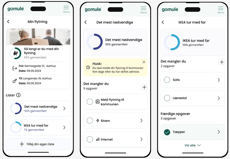
Launch of first MVP
After several rounds of iterations, we reached a point where the next step was to test the app in the real world to gather user data that wasn’t influenced by our presence.
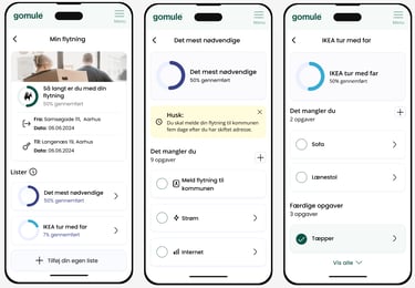
To do this, we launched an MVP focused on lists, specifically the ability for users to create their own lists and add tasks.
This first version served as a practical test to determine whether there was genuine interest in the functionality and to identify which parts of the experience could be optimized to make the app even more intuitive and user-friendly in subsequent iterations.

User insights and improvements

Based on the insights gathered from our MVP, it quickly became clear that several aspects of the design needed refinement.
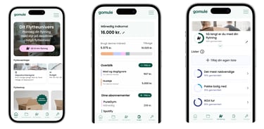
Users expressed a preference for a simpler visual expression with fewer strong colors, more white space, and clearer visual hierarchy. We also learned that relying solely on icons made navigation difficult for many users, which led us to introduce more explicit and recognizable buttons to improve clarity.
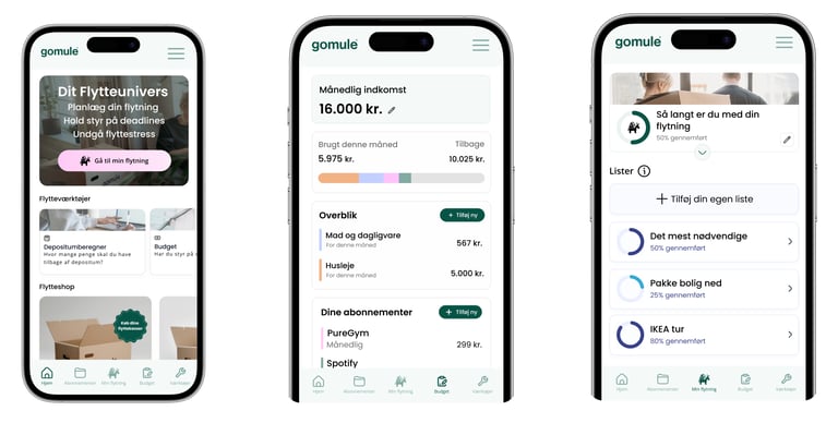
In addition to these visual and interaction-related adjustments, the MVP testing highlighted several feature gaps. This resulted in the addition of new elements such as a profile section, budgeting tools, moving-related utilities, and other functionalities that better supported users’ real needs. T
hese learnings formed the foundation for the next iteration of the app, making the experience more intuitive, focused, and aligned with user expectations.
Next step
Keep an eye on the gomule app in the App Store – new UI, UX, and features will be launched soon.

Link to gomule app
Get in touch
Feel free to reach out if you'd like to learn more about my work or discuss potential opportunities. I'm always up for meeting over a cup of coffee and having a chat!
Phone
+45 26208221
Nicoline.smedegaard@hotmail.com
www.Linkedin/Nicoline Due Smedegaard